Decision Modeling

Your Warehouse Stops at Dashboards. That's a Cost, Not an Investment.

Many organisations have spent millions on a data warehouse and got dashboards that have not changed a single decision. The root cause is that the project was designed to end at the report, not at the decision. This article explains why, and how to design it differently. The worked example is doctor rostering in a simulated network of 45 clinics; every number in it is simulated and is there to show the method, nothing more.

Infozense Decision Modeling · Executives · Operations · Data leads · ~8 minutes

Dashboards everywhere, decisions unchanged

Executives open the dashboards at the monthly meeting. The numbers are right and the charts look good. Then someone asks, "Which decisions changed last quarter because of this data?" and the room goes quiet.

The data is not the problem, and neither are the dashboards. The project was designed to end at the report instead of ending at the decision.

None of this is new. The industry already has names for it: prescriptive analytics, decision intelligence. The discipline that answers "what should we do?" is operations research, and it is decades old.

Yet in our experience it rarely makes it into data projects. Most are run by IT teams whose tools are ETL and dashboards, and when all you have is a hammer, every problem looks like a nail: each new question becomes another pipeline and another chart. So this is not a new theory. It is a way of working.
Five reasons data projects stop at dashboards

Nobody owns the decision. A dashboard puts nobody at risk. IT delivers it, executives look at it, and no one is accountable for whether it changed anything.

The team is missing a capability. When organisations staff a data project, they think of data engineers, data scientists and machine-learning engineers. Those roles build pipelines and predict what will happen. Executives are asking what to do about it, and that needs another perspective: optimisation under real constraints, the discipline of operations research and industrial engineering. From what we see, it is rarely on the team.

The warehouse is built for reporting, not deciding. A typical warehouse stores what already happened. A decision also needs data almost nobody loads: constraints and costs.

There is no feedback loop. Even when a decision is made from data, nobody records what was decided, when, and what happened next. The value of the project cannot be shown, and the next budget gets harder to approve.

The incentives make everyone stop at dashboards. Dashboards are easy to sell, easy to deliver and easy to sign off. Buyer and vendor are both happy to stop there.

Three levels, and the gap most projects fall into

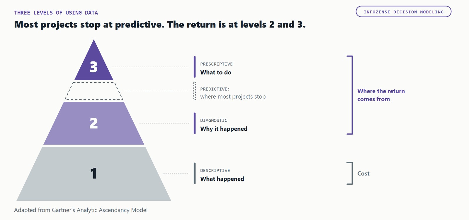
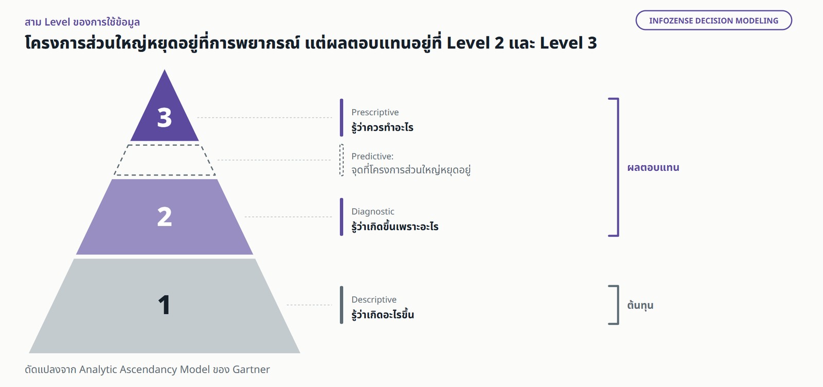
A three-level pyramid of data use, bottom to top: what happened (descriptive), why it happened (diagnostic), what to do (prescriptive), with a dashed, unnumbered Predictive band between levels 2 and 3 marking where most projects stop. The bottom level is the cost; the top two levels are where the return comes from. Adapted from Gartner's Analytic Ascendancy Model.พีระมิดสาม Level ของการใช้ข้อมูล เรียงจากล่างขึ้นบน ได้แก่ รู้ว่าเกิดอะไรขึ้น (Descriptive), รู้ว่าเกิดขึ้นเพราะอะไร (Diagnostic), รู้ว่าควรทำอะไร (Prescriptive) โดยมีช่องเส้นประ Predictive (ไม่นับเป็น Level) คั่นระหว่าง Level 2 กับ Level 3 ซึ่งเป็นจุดที่โครงการส่วนใหญ่หยุดอยู่ Level 1 คือต้นทุน Level 2 และ Level 3 คือที่มาของผลตอบแทน ดัดแปลงจาก Analytic Ascendancy Model ของ Gartner

Level 1: what happened (descriptive). Numbers that are correct, agreed by everyone and drawn from one source. This is what most warehouse projects deliver, and it has to be done well first.

Level 2: why it happened (diagnostic). Fair comparisons, finding where the problem actually sits, and checking the cause instead of guessing it.

Between levels 2 and 3 sits what Gartner calls predictive analytics: what is likely to happen. It is where most investment goes: data science, machine learning, forecasts. In our experience, it is also where most projects stop. A forecast tells you what is coming; it does not tell you what to do about it.

Level 3: what to do (prescriptive). An optimizer proposes options under the real constraints, and says what each option gains and what it gives up.

Level 1 is the cost. The return comes from levels 2 and 3, and the example below shows an organisation moving from level 2 to level 3 without building a separate forecasting model.

One dashboard, read at Level 1 and at Level 2

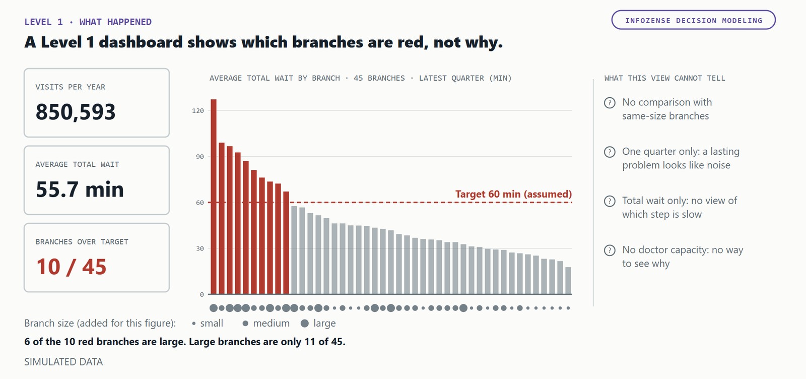
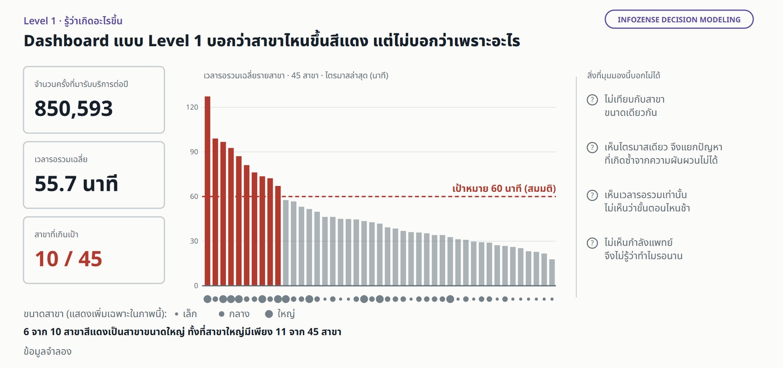
Picture a network of 45 clinics with about 850,000 visits a year (simulated data). At the monthly meeting, management opens the clinic performance dashboard: average waiting time by branch, and several branches are red.

Used to look at the numbers (level 1). The meeting discusses the red branches, asks the branch managers to explain, and agrees to watch them next month. Or it reaches for the obvious fix: more doctors at the red branches. Either nothing changes, or money goes to branches whose problem is not the doctor. Next month the same branches are red.

Mock of a Level 1 dashboard for 45 simulated branches: three tiles (visits per year, average total wait of 55.7 minutes, 10 branches over target) and a sorted bar chart of average total waiting time by branch for the latest quarter. Bars above a 60-minute target line (an assumption) are red: 10 branches, 6 of them large. Four notes say what the view cannot tell: no comparison with same-size branches, one quarter only, total wait only with no split by step, and no doctor capacity. Simulated data.ภาพจำลอง Dashboard แบบ Level 1 ของ 45 สาขาจำลอง มีตัวเลขสรุปสามช่อง ได้แก่ จำนวนครั้งที่มารับบริการต่อปี เวลารอรวมเฉลี่ย 55.7 นาที และ 10 สาขาที่เกินเป้า ถัดมาเป็นแผนภูมิแท่งเวลารอรวมเฉลี่ยรายสาขาในไตรมาสล่าสุด เรียงจากมากไปน้อย แท่งที่สูงกว่าเส้นเป้าหมาย 60 นาที (ค่าสมมติ) เป็นสีแดงรวม 10 สาขา ในจำนวนนี้เป็นสาขาขนาดใหญ่ 6 สาขา มีหมายเหตุสี่ข้อถึงสิ่งที่มุมมองนี้บอกไม่ได้ ได้แก่ไม่เทียบกับสาขาขนาดเดียวกัน เห็นไตรมาสเดียว เห็นเวลารอรวมแต่ไม่เห็นรายขั้นตอน และไม่เห็นกำลังแพทย์ ข้อมูลจำลอง

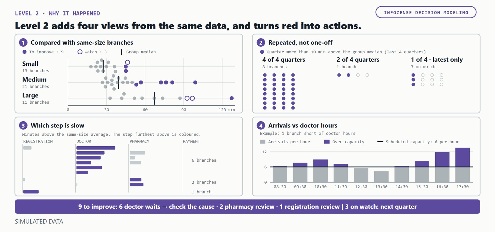
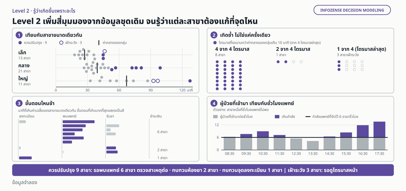
Used to find the cause (level 2). The warehouse needs four transformations, none of them new data: branches grouped by size, so each is compared with branches of a similar size; quarterly history, because the worst branch of one quarter tends to improve on its own (regression to the mean); waiting split by step, from registration to payment; and hourly patient arrivals against the doctor hours scheduled for that hour.

Of 45 branches, 9 repeatedly wait longer than their peers and 3 go on a watch list (simulated data). Repeatedly means two things: more than 10 minutes above the peer median, in at least 2 of the last 4 quarters. This is not the same list as the red branches at Level 1: 3 of the 10 red branches are large branches waiting no longer than their peers, and 4 of the 9 to improve were not red at all (simulated data).

The same meeting can now act. At 3 of the 9 the problem is not the doctor: 2 need their pharmacy reviewed and 1 its registration desk, with no new doctors. That leaves 6 branches where the wait for a doctor is the problem (simulated data). The 3 on the watch list wait for next quarter.

The Level 2 view of the same 45 branches in four panels. (1) Branches against the median of their size group: 9 to improve, 3 on watch. (2) Repeated, not one-off: 8 of the to-improve branches were over the line in 4 of the last 4 quarters and 1 in 2 of 4; the 3 watch branches in the latest quarter only. (3) Which step is slow: 6 branches on doctor waits, 2 on pharmacy, 1 on registration. (4) For one example branch short of doctor hours, patients arriving exceed the doctor capacity of 6 per hour in 8 of 10 hourly slots. Actions: 9 to improve (6 doctor waits, check the cause; 2 pharmacy review; 1 registration review); separately, 3 on watch until next quarter. Simulated data.มุมมอง Level 2 ของ 45 สาขาเดิม แบ่งเป็นสี่ส่วน (1) เทียบกับค่ากลางของสาขาขนาดเดียวกัน ควรปรับปรุง 9 สาขา เฝ้าระวัง 3 สาขา (2) เกิดซ้ำ สาขาที่ควรปรับปรุงรอนานกว่ากลุ่มใน 4 จาก 4 ไตรมาส 8 สาขา และ 2 จาก 4 ไตรมาส 1 สาขา ส่วนสาขาเฝ้าระวัง 3 สาขาเกินในไตรมาสล่าสุดเท่านั้น (3) ขั้นตอนที่ช้า รอพบแพทย์ 6 สาขา รอรับยา 2 สาขา ลงทะเบียน 1 สาขา (4) ตัวอย่างสาขาหนึ่งที่ชั่วโมงแพทย์ไม่พอ มีผู้ป่วยเข้ามามากกว่ากำลังแพทย์ 6 รายต่อชั่วโมงใน 8 จาก 10 ช่วงชั่วโมง สรุปสิ่งที่ต้องทำ: ควรปรับปรุง 9 สาขา ได้แก่ รอพบแพทย์ 6 สาขา ให้ตรวจสาเหตุต่อ ทบทวนห้องยา 2 สาขา ทบทวนจุดลงทะเบียน 1 สาขา ส่วนอีก 3 สาขาให้เฝ้าระวังและรอดูไตรมาสหน้า ข้อมูลจำลอง

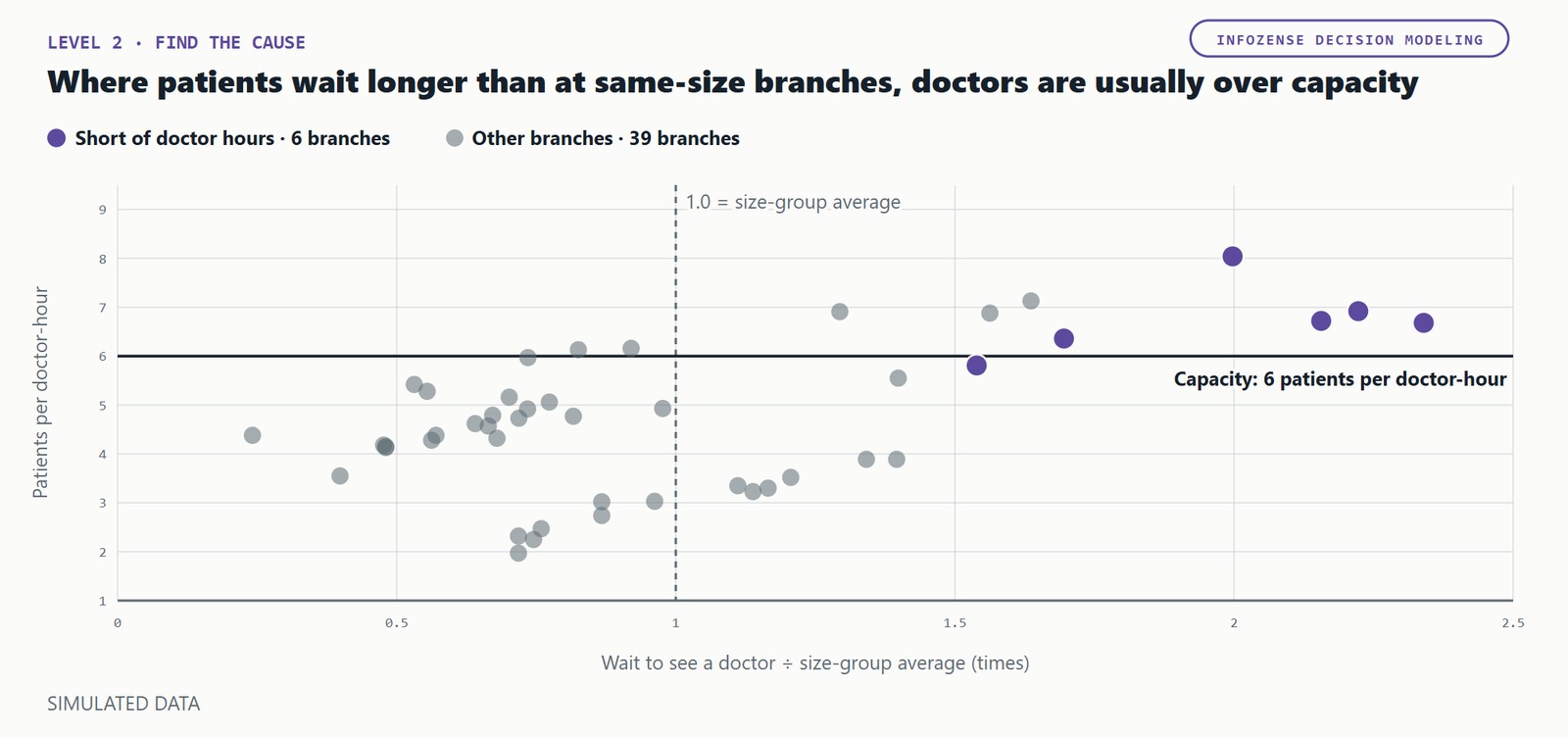
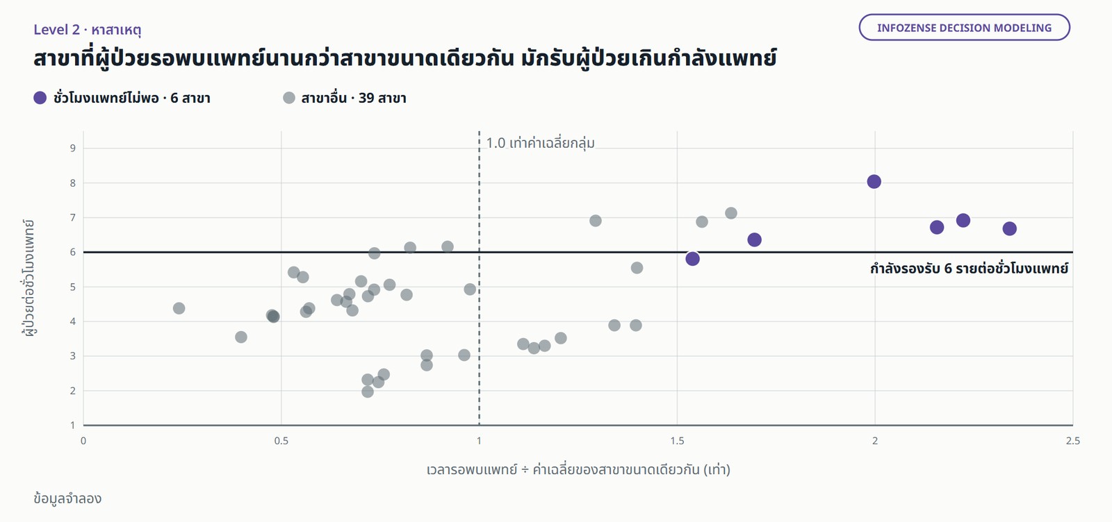
Digging deeper into the 6 branches. Before concluding "not enough doctors", ask two questions the data can answer directly.

Scatter plot of 45 simulated branches. Horizontal axis: wait to see a doctor relative to the size-group average. Vertical axis: patients per doctor-hour, with a capacity line at 6. The 6 branches short of doctor hours sit mostly above the line (5 above, 1 just below) and wait about 1.5 to 2.3 times the group average. Simulated data.แผนภาพกระจายของ 45 สาขาจำลอง แกนนอนคือเวลารอพบแพทย์เทียบกับค่าเฉลี่ยของสาขาขนาดเดียวกัน แกนตั้งคือผู้ป่วยต่อชั่วโมงแพทย์ มีเส้นกำลังรองรับที่ 6 ราย สาขาที่ชั่วโมงแพทย์ไม่พอ 6 สาขาส่วนใหญ่อยู่เหนือเส้นนี้ (5 สาขา อีก 1 สาขาอยู่ใกล้เส้น) และรอนานกว่าค่าเฉลี่ยกลุ่มประมาณ 1.5 ถึง 2.3 เท่า ข้อมูลจำลอง

Are the doctors at these branches slower? In the simulated data, the average consultation in hours with a queue is 10 minutes, the same as everywhere else.

Do patients arrive above the planned capacity more often? In the simulated data, about two thirds of opening hours see more patients arrive than the scheduled doctors can handle, against fewer than half at other branches.

The doctors are not slower. These branches have too few doctor hours when patients arrive, while 9 other branches have doctor hours to spare (simulated data). So the answer is not necessarily to hire; it may be to move sessions. Deciding that is Level 3.

Level 3: let the optimizer propose, and let management decide

The question a dashboard cannot answer is how the roster should change. To answer it, the warehouse also needs the data almost nobody loads: which doctor is available when, how long a session is, how many hours a part-time doctor may work, what an hour costs, which branches are close enough to share doctors, and a decision record of every decision taken.

Before anything is solved, management ratifies the two parts of the frame: the goal, and the constraints from that data. An optimizer can then propose three kinds of change: re-time sessions within each branch, keeping the same hours; move part-time sessions between nearby branches on the same day; or release sessions that are not needed, planned so that no branch waits longer than today on the planning data.

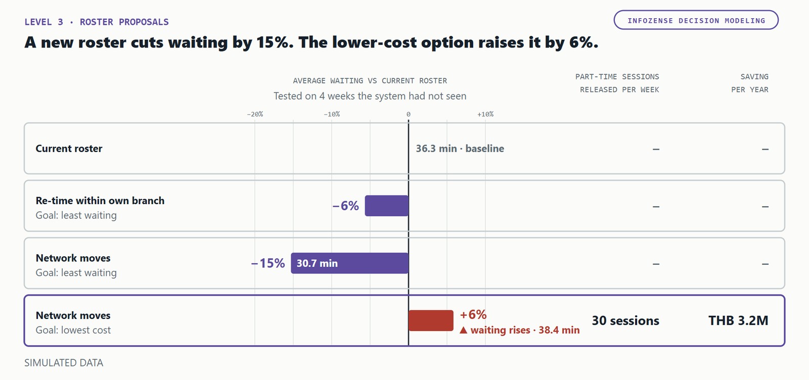
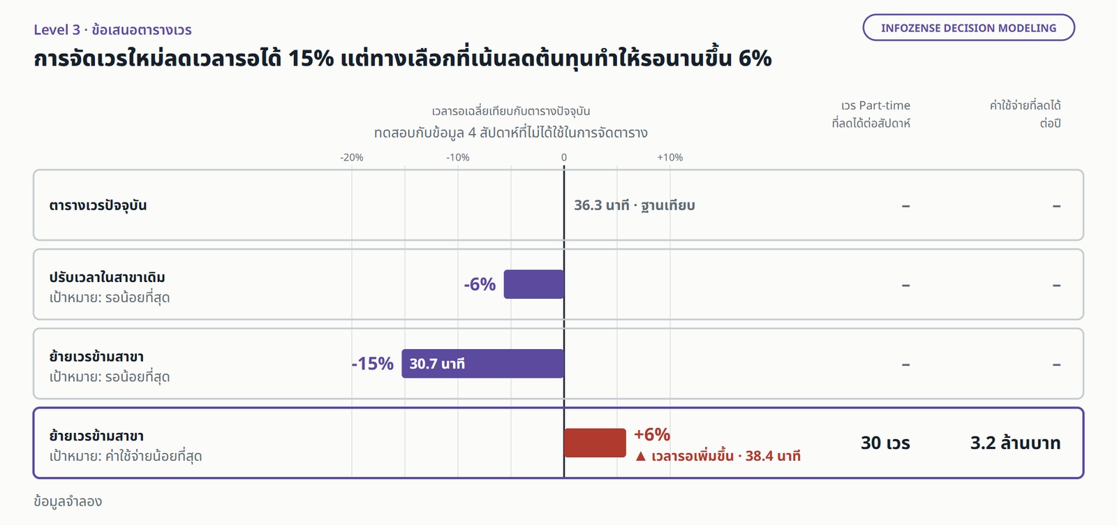
Bar chart comparing roster proposals with the current roster, tested on 4 weeks the system had not seen. Re-timing within the own branch cuts average waiting by about 6%. Network moves for least waiting cut it by about 15%. Network moves for lowest cost release 30 part-time sessions a week, about THB 3.2 million a year, but waiting rises by about 6%. Simulated data.แผนภูมิแท่งเปรียบเทียบข้อเสนอตารางเวรกับตารางปัจจุบัน ทดสอบกับข้อมูล 4 สัปดาห์ที่ไม่ได้ใช้ในการจัดตาราง ปรับเวลาในสาขาเดิม เวลารอลดลงราว 6% ย้ายเวรข้ามสาขาเพื่อรอน้อยที่สุด ลดลงราว 15% ย้ายเวรข้ามสาขาเพื่อค่าใช้จ่ายน้อยที่สุด ลดเวร Part-time ได้ 30 เวรต่อสัปดาห์ ประมาณ 3.2 ล้านบาทต่อปี แต่เวลารอเพิ่มขึ้นราว 6% ข้อมูลจำลอง

In the simulated data, the optimizer planned on the latest quarter's hourly patient volumes and was tested on the following 4 weeks, which it never used for planning. With cross-branch moves allowed, it produced two proposals.

If the goal is shorter waits: in the test weeks, average waiting falls by about 15%, with the same doctor hours (simulated data).

If the goal is lower cost: 30 part-time sessions a week can be released, worth about THB 3.2 million a year. But in the test weeks, average waiting rose by about 6%, from 36.3 to 38.4 minutes (simulated data).

A roster that looks good on the data it was planned on is no guarantee for the weeks that follow. Management has to see both sides before deciding. The optimizer proposes; it does not decide.

Every rule has a price, and costs fall like a staircase

Every operating rule has a price, and it can be measured. In the simulated data, if doctors must stay at their own branch and only their start times can change, waiting falls by about 6%. Allow part-time sessions to move to a nearby branch on the same day, and it falls by about 15%. Management sees how "expensive" each rule is, and decides whether to keep it.

Costs fall like a staircase, not along a smooth line. Sessions are released one whole session at a time, so savings and waiting both move in steps. A "10% saving" that does not name the sessions cannot be acted on.

Prove it against a control group

A model's numbers are not results. The right way is to trial the new roster at some branches and compare them with similar branches that keep the old one.

Log every decision in the decision record, and measure the outcome from the same warehouse. If it works, roll it out. If it does not, you find out quickly and cheaply.

Design the data project to reach decisions

Start from recurring decisions, not from data sources. Instead of asking "what data do we have?", ask "what do we decide again and again, every week and every month?" Rosters, drug purchasing, staffing. Then design the warehouse starting from those questions.

Design the data model for decisions. Store constraints, capacity and costs from day one, as in the example, with a decision record of who decided what, and from which proposal.

Accept the project on decisions supported, not dashboards delivered. Acceptance criteria should name the decisions the data will support and how the outcome will be measured.

Staff every role. Next to data engineers and analysts, you need an optimisation specialist and an executive who clearly owns each metric. Everyone works in one loop.

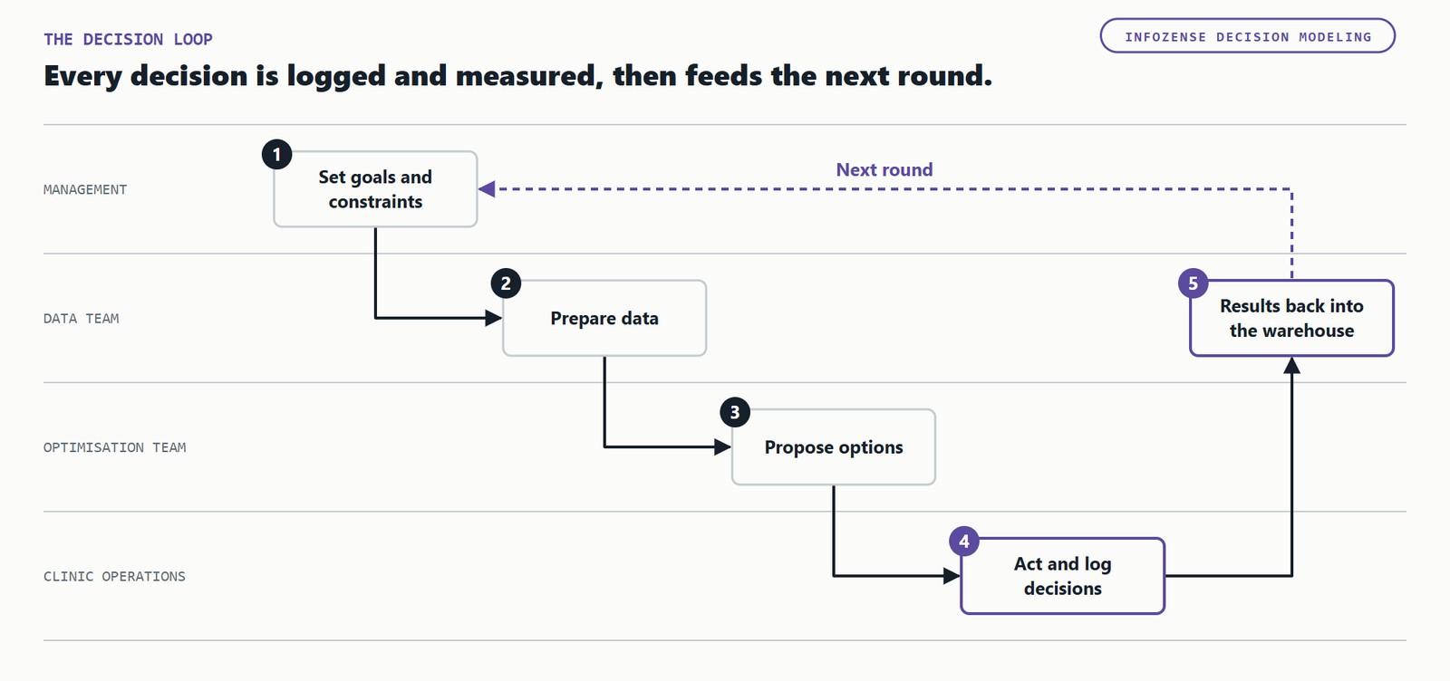
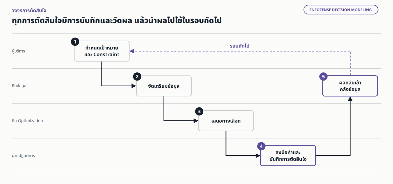
A five-step loop across four teams. Management sets goals and constraints; the data team prepares data; the optimisation team proposes options; clinic operations act and log decisions; the results go back into the warehouse and feed the next round.วงจรการทำงานห้าขั้นตอนข้ามสี่ทีม ผู้บริหารกำหนดเป้าหมายและ Constraint จากนั้นทีมข้อมูลจัดเตรียมข้อมูล ทีม Optimization เสนอทางเลือก ฝ่ายปฏิบัติการลงมือทำและบันทึกการตัดสินใจ ผลกลับเข้าคลังข้อมูล แล้วเข้าสู่รอบถัดไป

Be selective. Not every decision is worth optimising. The ones that are share three traits: they recur, their constraints are clear, and their outcome can be measured. Rosters, stock levels and staffing are typical.

Where else this applies

The example is a clinic network, but problems with the same structure exist across public primary care: scheduling doctors who travel from community hospitals to sub-district health promoting hospitals, distributing drugs and supplies between facilities, and matching staff to the real patient volume of each area.

The constraints and goals differ; the way of working is the same.

The honest limit

Every number in this article is simulated. It is not evidence of what your organisation will see. Real outcomes depend on your own patient volumes, constraints and roster discipline.

An optimizer is only as good as the constraints it is given. If the record of which doctor is available on which day is wrong, the roster it proposes is unusable.

Above all: if nobody owns the decision, none of this helps.

The bottom line

A warehouse that stops at dashboards is a cost. The return comes from decisions that change and outcomes that can be measured. Getting there does not take new technology. It takes a project designed from the decisions backwards, constraints and costs kept in the warehouse, and results proven against a control group.

Before approving the next data budget, ask one question: "Which decisions did this data change last quarter, and what did they deliver?" If nobody can answer, the problem is not the data. It is the design of the project.

You don't build this. You frame it.

Infozense does not sell a solver, and we will not ask you to replace the tools you already use. We work with your team to:

  • Frame the recurring decisions with you: goals, constraints and tradeoffs, with management ratifying the frame.
  • Add constraints, costs and a decision record to the warehouse you already have.
  • Connect a solver, open-source or commercial, whichever you choose.
  • Design a controlled trial to measure the real outcome.

What you frame is the decision, the goals and the operating rules. Not code.

Infozense Decision Modeling

Which decisions did your data change last quarter?

We showed you the method on a simulated network of 45 clinics. Your organisation has its own decisions, constraints and numbers. Tell us which decisions your organisation makes again and again, and we'll spend 2 hours framing them with your executives and data team, free of charge. You leave with the 3 decisions most worth supporting with data, and a list of what your warehouse is still missing.

Let's talk →

contact@infozense.com  |  +66-82-242-4008  |  Bangkok, Thailand